Model driven components are a great way to quickly build out an app with consitent styling.
When making web forms there are lots of subtle descisions you need to be make about display, validation, error handling and UX. By using a form builder component with a form definition you can make these desicions in one place, save lots of repetitive and support a wide variety of forms.
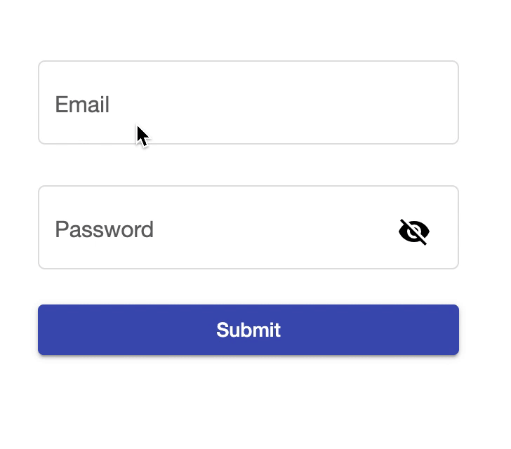
In this post I will talk about a form builder component I made for Real Email. In the login & user management features there are 5 instances of this form alone! Imagine all the horrible copy and pasted html & css that would be needed without this form builder component.
In Angular we will create a form component that accepts a simple model of the form and renders it. In React you can create a similar component.
Using the form will be as simple as.
<app-form [fields]="fieldsModel" [onSubmit]="onSubmit.bind(this)">
</app-form>
With a definition of.
fieldsModel = {
  email: {
    label: "Email",
    type: FieldModelType.Text,
    formControl: new FormControl("", [Validators.required]),
    errorMessage: "Email is required",
  },
  password: {
    label: "Password",
    type: FieldModelType.Password,
    formControl: new FormControl("", [Validators.required]),
    errorMessage:
      "Password is required, it must be 8 characters and have a number.",
  },
};

const onSubmit = () => {
  console.log(
    "submit",
    fields.email.formControl.value,
    fields.password.formControl.value
  );
};
The form model uses the FromControl from angular reactive forms. This allows flexibility in form validation and access to the values in the submit function.
In the submit function you dont need to deal with any of the validation that is taken care of by the form component. And it is all done consistency.
To display validation error messages in this application we are taking the general approch of showing an error asking what is required. In your app you could take the approach of showing exactly what is wrong eg, ‘Password is missing a number.’. This would require extending the errorMessage model.
The basic structure of the component loops over the input model and renders them in their different types. A submit button is at the bottom, which takes care of checking that the form is valid and putting the form into a loading state disabling the button to prevent double clicking.
<form [formGroup]="form" (ngSubmit)="submit()">
  <div *ngFor="let field of fieldModels">
    <div *ngIf="field.type === FieldModelType.Text">
    	..
	</div>
	<div *ngIf="field.type === FieldModelType.Password">
    	..
	</div>
  </div>
  <button
    type="submit"
    color="primary"
    disabled="{{ loading }}"
  >
    {{ submitLabel }}
  </button>
  ..
</form>
The complete component as used in my app Real Email is as bellow with using material UI styling.
export enum FieldModelType {
  Text,
  Password,
}

export interface FieldModel {
  label: string;
  type: FieldModelType;
  formControl: FormControl;
  errorMessage?: string;
}

@Component({
  selector: "app-form",
  templateUrl: "./form.component.html",
  styleUrls: ["./form.component.css"],
})
export class FormComponent implements OnInit {
  form: FormGroup;
  @Input() onSubmit: () => Promise<void>;
  @Input() fields: { [key: string]: FieldModel };
  fieldModels: FieldModel[];
  @Input() submitLabel = "Submit";
  loading = false;
  FieldModelType = FieldModelType;
  hide = true;

  ngOnInit(): void {
    const keys = Object.keys(this.fields);
    const z: { [key: string]: FormControl } = {};
    const controls = keys.reduce((acc, i) => {
      acc[i] = this.fields[i].formControl;
      return acc;
    }, z);

    this.fieldModels = keys.map((i) => this.fields[i]);

    this.form = new FormGroup(controls);
  }

  submit(): Promise<void> | undefined {
    this.form.markAsTouched();
    if (this.form.valid && !this.loading) {
      this.loading = true;
      const result = this.onSubmit();
      if (result) {
        return result.finally(() => (this.loading = false));
      } else {
        this.loading = false;
      }
    }
  }
  showError(fc: FormControl): boolean {
    return fc.invalid && (this.form.dirty || this.form.touched);
  }
}
<form [formGroup]="form" (ngSubmit)="submit()">
  <div *ngFor="let field of fieldModels">
    <div *ngIf="field.type === FieldModelType.Text">
      <mat-form-field appearance="outline">
        <mat-label>{{ field.label }}</mat-label>
        <input matInput [formControl]="field.formControl" />
        <mat-error *ngIf="showError(field.formControl)">{{
          field.errorMessage
        }}</mat-error>
      </mat-form-field>
    </div>
    <div *ngIf="field.type === FieldModelType.Password">
      <mat-form-field appearance="outline">
        <mat-label>{{ field.label }}</mat-label>
        <input
          matInput
          [type]="hide ? 'password' : 'text'"
          [formControl]="field.formControl"
        />
        <button
          mat-icon-button
          matSuffix
          (click)="hide = !hide"
          [attr.aria-label]="'Hide password'"
          [attr.aria-pressed]="hide"
        >
          <mat-icon>visibility</mat-icon>
        </button>
        <mat-error *ngIf="showError(field.formControl)">{{
          field.errorMessage
        }}</mat-error>
      </mat-form-field>
    </div>
  </div>
  <button
    mat-raised-button
    type="submit"
    color="primary"
    disabled="{{ loading }}"
  >
    {{ submitLabel }}
  </button>
  <mat-progress-bar *ngIf="loading" mode="indeterminate"></mat-progress-bar>
</form>