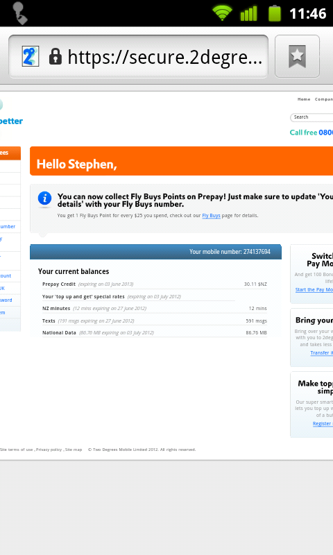
When on a small screen, the 2degrees site puts some of the content to the left of screen where you can’t see or click it. I noticed this on my smart phone when trying to top up.
Here what It looks like on my desktop.
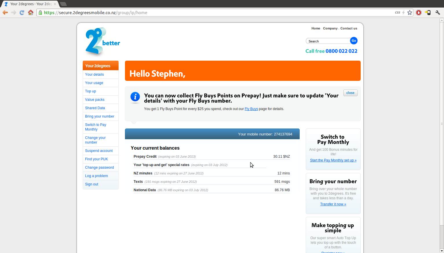
Notice the important “Top Up” button in the navigation menu on the left. This cannot be clicked on my phone.
The web page is made with a main div that is the first thing in the body of the html who’s job is to center the content. It has a fixed width to ensure the layout of its contents don’t change. This a common technique used on many website including ones that work on smart phones. The stupid thing is how its done. Normally css rules like bellow are used for this job. If the screen is less than 1000px the browser can scroll to display the content.
#wrapper
{
  width:1000px;
  margin-left:auto;
  margin-right:auto;
}
What 2degrees have done is this.
#wrapper
{
  width:1000px;
  float:left;
  position:absolute;
  left:50%;
  margin-left:-500px;
}
With the absolute positioning. It puts the start location, the upper left corner of the main div in the middle of the screen. Then the left margin is set to -500px which centers it. But when the screen is less than 1000px as on a phone. The left of the main div is off the screen where it cannot be seen.