I’ve been using Life Logger to track how long I spend at work. It has a pretty rudimentary way to get summaries from it. I wanted to see a graph of how long I’ve spent at work in a graph so I exported the database and made my own.
Here’s what I Came Up With.
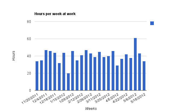
If my boss sees this, its all those public holidays that bring those hours down.
Here’s how I did it. I exported the database from the app. I love how on android I can send it to drop box and pick it up on my computer.
Its a sqlite database, which I can easily manipulate using the sqlite tools on my computer.
The Timestamps are stored as milliseconds from the unix epoch rather than a normal sql date. The developer is must be using the java
system.currenttimemillis().The table Im interested in is this one.
Dates can be pulled out with the sql query.
CREATE TABLE tbl_log (_id INTEGER PRIMARY KEY AUTOINCREMENT,time_card_id_ref INTEGER NOT NULL, start_time INTEGER DEFAULT 0, end_time INTEGER DEFAULT 0, estimation INTEGER DEFAULT 0, note TEXT );
strftime("%Y-%M-%d",start_time/1000, "unixepoch") from tbl_log;
I can get the weeks of each entry with this entry. This gives year-week like 2012-2, which is good to group by.
select strftime("%Y-%W", start_time/1000, "unixepoch") from tbl_log;
I can get the hours worked in a week by using the sum function over a set like this.
select sum(end_time-start_time)/1000/60/60 from tbl_log where strftime("%Y-%W", start_time/1000, "unixepoch") = "2012-16";
This can be done for all weeks like this. The sum is an aggregate function which runs on the rows that are grouped by.
select strftime("%m/%d/%Y", start_time/1000, "unixepoch"), sum(end_time-start_time)/1000/60/60 as hours_worked from tbl_log group by strftime("%Y-%W", start_time/1000, "unixepoch");
which gives the times like this which can be imported into a spreadsheet and charted.
11/20/2011|34
11/27/2011|35