Heres the visualization I made.
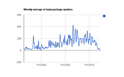
Heres how I did it.
#First download the changelogs.ubuntu website, only use the main pool.
wget -m -np -r http://changelogs.ubuntu.com/changelogs/pool/main/
#Search for all time stamps and print them out.
egrep -o -r -e "[A-Z][a-z]{2}, [0-9]{0,2} [A-Z][a-z]{2} [0-9]{4}" > dates.main
I then wrote a python script to count how many dates were in each week and average that over the month.
#!/usr/bin/env python
import sys,time
dates_in = {}
for line in sys.stdin.readlines():
line = line.rstrip()
if line in dates_in:
dates_in[line] = dates_in[line]+1
else:
dates_in[line] = 1
month_counts = {}
for dateS,count in dates_in.items():
date =time.strptime(dateS, "%d %b %Y")
month_date = "%d/01/%d" % (date.tm_mon,date.tm_year)
if month_date in month_counts:
month_counts[month_date] = month_counts[month_date] + [count]
else:
month_counts[month_date] = [count]
for dateS,count in month_counts.items():
print dateS+","+str(sum(count)/len(count))
Run that on the downloaded changelogs.
python data.py < dump/dates.main > weekly.avg.pr.month.csvThen I imported that csv into google docs to make the graph.